My first Usabilathon has come to end! It started last Friday (March 5) and lasted an entire week. My team and I used Axure RP 9 to create our prototype. I really like Axure, it was easy and fun to use. I also liked how collaborating Axure was similar to Git. Instead of pushing and pulling changes, it was checking in and checking out changes haha.
Here’s the link to our video presentation and a link to our prototype School Findr.
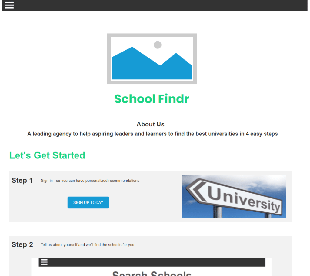
Below is a snippet of the homepage of our prototype.
We were tasked to create:
“The goal of this challenge is to design a web or mobile app that will provide both information about paying for college and guidance on planning a post-secondary education experience so that prospective students are empowered to achieve their personal goals and satisfy their financial needs.“
Abstract for School Findr (298 words)
“First-generation students face barriers when accessing information to higher education. In fact, many first-generation students only apply to one school because they are unaware of other options that are available to them. Also, first-generation international students face problems such as understanding their financial obligations based on their residency status. In the beginning of the Usabiliathon, research was done to understand the user by looking at existing websites and asking a first-generation international student about his experiences. Team WATCHout defined their user as first-generation students, with an emphasis on international students. Next, a flowchart of key features and page functions was created. The prototype underwent testing throughout the week of the Usabilathon. Then, team WATCHout developed a prototype website called School Findr to help first-generation and first-generation international students make an informed decision about planning for college and understanding their financial obligations. The prototype was created with Axure RP 9 and all team members had designated pages to design and create. The user will begin with the Home Page and a brief tutorial. Next, the user will make an account and begin the search for schools. The user would enter their majors of interest, cumulative GPA, and test scores. A ranked list of U.S. universities will appear. The user can then click on the school of interest, which will redirect them to page with a general overview of the school and other information of interest. Also, a budget calculator is provided to help students determine their financial obligations to a university. Important features of the budget calculator include a currency converter, financial costs based on the user’s status and desired criteria (e.g. If they are an international student and if they want to pursue a 4-year college), and if scholarships are available based on the user’s information.”
Thaaanks! 😀
First of all, I want to thank the WATCHout team (Baganesra Bhaskaran and Austin Garcia) for being awesome team members. I enjoyed working with them and it was nice getting know some of the people in my research group.
Second, I want to thank the organizers (especially Melynda Hoover and Kaitlyn Ouverson for always being present to answer questions) for having this event!
Third, I want to thank Kacie Eberhart from IBM for providing valuable advice.
This was my first opportunity to explore User Experience (UX) and principles. I wanted to reflect on my experience.
1. Fundamental UX tips/practices!
Okay, so my question to Kacie was:
“Hello! What are some fundamental UX tips/practices that someone should know? This is my first Usabilathon and I don’t have much experience with user design (my background is in Mechanical Engineering)”
And Kacie replied back with extremely useful information:
“>>>> Keep the User as the starting point for everything you make<<<<
Understanding who you are designing for and empathizing with them should always be the foundation of everything you build. This means know what your user s doing, thinking, feeling before, during, and after their interaction with your solution.
Other areas to always include in UX design are:
- Storyboarding
- User flow mapping
- Sketching concepts (this can vary from writing out your ideas to drawing what it could look like)
- Understand what sort of interactions are common for the user and try to replicate them within our experience (this will reduce their learning curve)
- Always keep accessibility in mind
- User test early and often to refine your work“
2. Start video renders early lol
The time limit for our video presentations was 8-10 minutes. Our first recordings went over time (which surprised us because we thought we’d be going under time).
And we cut it really close to the deadline because the video was taking its sweet time rendering!
3. Aaaand make sure you include audio when you render your video
Yeaaaa 😂😅
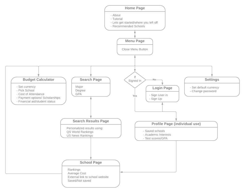
4. Flowcharts are very useful
The team and I used Lucidchart to map the general flow of our prototype website. It went through a bunch of changes, and it was nice having a visual representation (see below).
5. Get to know your user
In our case, we focused on first-generation students. But we also wanted to understand first-generation international students. Fortunately, one of my teammates is a first-generation international student he provided key insights about his experiences that shaped the prototype.
Interview and research your user base. Understand what makes their situation and experiences unique as well. Because no two people are exactly the same.
